Often times when proofing a session, I'll come across a handful of images that I LOVE and mentally mark as favorites. And when my client places their order, it's fun to see which they've chosen as their favorites and compare.
I'm lucky in that most of my clients are typically looking for something a little more untraditional then what you'd find at the chain photo studio and I think the images on my website portray that. Being on location gives me that freedom.
Typically, a few of my faves are in what they've ordered, but there are definitely times when I'm completely surprised to see the shots they've chosen. It makes me wonder if maybe they don't completely understand the look I was going for or simply just don't care for the particular expression in a certain photo.
That being said, just recently I came across this little blurb on a photographers blog I frequent and I think it really helps explain my style and why I do what I do...
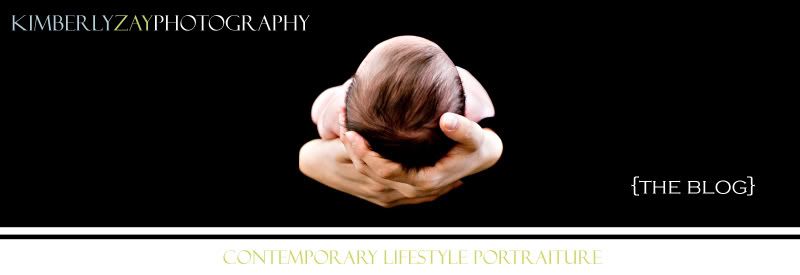
“Tight Crops” –
This means super close close-ups where often the face fills most of the frame of the image. These images are about the eyes, and often the top of the head is not included in the image. I meant to do that!
“Not-So-Smiley”-
So many of us have been brought up to believe that a smile is a requirement to make a great photo. So not true! I love a pensive look as much as a big grin. I meant to do that!
“Let’s Be Negative”
Negative space is when the subject is placed off to the side of an image and the rest of the image is empty—this is done for artistic impact. I meant to do that!
“Left of Center”
The most boring position for a subject in a photograph is smack dab in the middle! I know, I know, not what you always thought, right? Trust me! There is a little something in design called the Rule of Thirds that we photographers often employ to enhance visual interest.
The rule states that an image can be divided into nine equal parts by two equally spaced horizontal lines and two equally spaced vertical lines (like a tic-tac-toe board). The four points formed by the intersections of these lines can be used to align features in the photograph. Aligning a photograph with these points creates more tension, energy and interest in the photo than simply centering the feature would.
Huh? Trust me, your child does not need to be right in the center of an image for it to be a good portrait! I meant to do that!
“The Light in the Eyes”
The hallmark of good portrait photography is good lighting, and the hallmark of good lighting is something called a “catchlight,” – a reflection of light in the eyes. I love big catchlights! I purposely position my lights for the best and largest catchlights, especially for close-ups. Flip through any parenting or glamour magazine and look at the eyes—what do you see? Big bright catchlights! A lack of catchlights leaves the eyes looking flat, dull and lifeless.
I meant to do that!
Tuesday, May 27, 2008
I meant to do that!
Subscribe to:
Post Comments (Atom)


No comments:
Post a Comment